Showing posts with label adobe lightroom. Show all posts
Showing posts with label adobe lightroom. Show all posts
Monday, November 16, 2009
Photographing Infants: Why Black and White is Back
 Today I want to get a little more technical and talk about color vs. black and white. For my generation black and white is very popular. We ( the 20 and 30 somethings out there) associate it with editorial or candid photography and consider it timeless. My parents age group (baby boomers) often find black and white boring. The main difference stems from the fact that color photography did not become widely used until the late 1950's and into the '60's. Color films ( such as Kodak's Kodachrome) had been available to the public since 1935 but was considerably more expensive and difficult to process compared to black and white. As color movies became more popular in theaters and color televisions became fixtures in homes across America, consumers turned from "traditional" black and white films to the vibrant colors of slide film. With this transition a new form of torture was invented; the slide show. Countless girlfriends and neighbors have been bored to tears during one of these events. 2009 was the year in which Kodachrome was retired by Kodak marking the end of an era. No worries though, thanks to social networking and the advent of digital photography badly exposed or blurry/unrecognizable images are everywhere and multiplying at an exponential rate. Now would probably be a good place to mention my Facebook page! Please become a fan. You can also follow me on Twitter.
For comparison sake, the same image is shown in color on the right. Notice the difference in contrast between the black and white version and the color version. Personally I like my color images with less contrast and I avoid over saturation since I also want my colors to look natural.
Black and white is a different story though, additional contrast is necessary to help separate the shades of gray from one another. It also changes the mood of an image. The black and white version emphasizes texture. By removing the distraction of color the viewer looks only at the light and shadows. This most basic photographic style hits directly to the heart of what photography is all about: the interplay of light and dark. This is also why it lends itself so nicely to infant portraits. Infant portraits most frequently seek to minimize the amount of information in an image and instead focus your attention on the tiny features of newborns.
Since most of us aren't shooting black and white film let's talk about how to make the best possible black and white image from a digital file. Photoshop provides several ways to convert an image to black and white, a few of which I'll show you here. Lightroom also does a very nice job with black and white. Let's start with Photoshop. The most basic ways to change a color image to black and white in Photoshop is either the Desaturate or convert to Grayscale Here are the results.

The Desaturate option converts colors exactly as they are where the grayscale tries to estimate what they should be. Both are good efforts but not exactly right. With either method, all of the colors are converted to a shade of gray. Reds and greens often become the same when converting between color and black and white. The image then looses contrast and lacks a diversity in the tonal range. Or as my college professors used to say it looks "flat" or "muddy". I always wanted to ask if those were technical terms... When the tonal range has been dramatically reduced like this doesn't the image seem less interesting since the details are not as clearly visible? To fix this the next step needs to be introducing more contrast to increase the tonal range. This can also be done a number of varying ways. Adjusting the Brightness/contrast is the most basic but it gives you the least amount of control.

Select Image>Adjustment>Brightness/Contrast to get the menu shown above. I increased the contrast 100 percent (I would have done more if possible) and decreased the brightness slightly (shown as a negative number). Here is the resulting image.


reds: 10%
Yellows: 49%
Greens: 31%
Cyans: 79%
Blues: 73%
Magentas: 45%
Notice how the version of our feet photo in the screen shot looks rich and interesting. The details are more pronounced and all of the shades of gray separate creating a more visually dynamic image.
For Lightroom the process is similar to the black and white adjustment in Photoshop, the terminology is the only difference. Select your image in the develop module and then use the grayscale button to convert into grayscale. You can then adjust your highlights with the recovery slider and the shadows with the fill light and/or blacks sliders. Contrast is pretty self explanatory. By adjusting each of these separately you can gain the most control over the tonal range of the image. Best part is that with Lightroom you can make these adjustments on multiple images.


Next up tips for making an infant portrait shoot more successful.


Sunday, November 1, 2009
What you don't know about your camera can hurt you.
As much as I would love to summarize the entire History of Photography course I took in college in one blog, I want to talk mainly about why knowing a thing or two about optics can change the way you photograph.
Since the advent of the view screen, many point and shoot cameras (thanks to the habits of their consumers) have dropped the viewfinder all together. Even the Nikon D-300 I shoot with has the option of using Live View and skipping the viewfinder all together. This is just one example of how photography continues to adapt to the needs of the user. The SLR (single lens reflex) came from a similar revision that allowed the photographer to see exactly (or at least a more accurate view) of what would be captured on the film plain. Today film has given way to digital sensors and a whole host of people owning digital SLR's. Sadly though, many have fallen prey to the fallacy that by owning a camera with more megapixels, you will instantly take better photos.
As with all technology, operator error is the main reason for poor results. So for all of you that have said to me "I really like photography, I wish I knew more about it." Here you go. Free, uncensored advice from a pro on how to subtly improve the images you create. So let's start right now with something simple.
Depth of Field
Since Wikipedia already exists, you'll need to use the link above for a scientific perspective and exact definition of Depth of Field (DOF). Let's talk about the application of this technique. (And some other more advanced stuff just for fun).

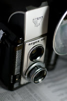
The image you see here is of an twin lens Argus 40. Use the link to learn more about the camera, it's history and see images of a mint condition one (mine is beat up somethin' terrible) and images made by this great little camera. I thought this would be appropriate subject matter since it's one of the precursors to the SLR. The image was shot "wide open." The exposure is 1/320s @ f2.2 . The lens is a 50mm (Standard) which can actually go as wide as F1.4 but I wanted to make sure I got the entire brand name in focus. My light source was a compact florescent bulb about 5 inches to the right of the subject and a folded piece of white paper for a fill card on the left. The newspaper is shown below the Argus 40; it just felt right to show two antiquated but completely functioning objects together.
Can you see the isolation that shallow DOF brings? Nothing is in sharp focus outside the words Argus 40, and even there sharpness begins to fall off at the 40 ever so slightly. The newspaper is illegible (which wouldn't be the case if I was shooting at an equivalent exposure like 1/2 sec. @ F 16. At a smaller aperture DOF increases forwards and backwards from the point in which the camera is focused. Depending on your intent, DOF is one of the most important tools in photography. It helps to create a point of interest, is key as a design element, and since it is tied directly to the basic operation of all cameras, crucial for the photographer to know how to use properly. The simple act of knowing what F-stops produce greater and less DOF will revolutionize any beginning photographer. You should be the one deciding your camera's exposure, not the camera. So many of the evolutions in photography (internal metering, auto focus, zoom lenses) are wonderful tools for the skilled user, but they have become handy-caps for the novice. Photography is a science AND art. You cannot do one properly if you neglect the other in this medium.
Okay, enough ranting... anyone want to know how to about how to mimic the blue hue in the above image? I use Adobe Lightroom 2.0 to edit my images. As a wedding and portrait photographer I deal in volume and Lightroom has been a saving grace. This year alone I have processed over 64,000 images in record time thanks to this well designed software.
Here is the original image. After importing it into Lightroom I adjusted the settings under the develop tab to these amounts:
Color Temperature: 2100 Kelvin
Tint or Hue: +18 (towards the magenta end of the spectrum)
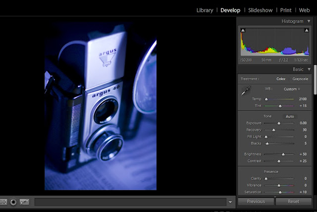
That's all it takes to fake the look to a tungsten balanced film shot in daylight. You see, the color of light is based on it's Kelvin temperature. Daylight is about 5500K and with the advent of color film came the need for multiple types of film to match the variety of light sources besides the sun. These include your regular 60 watt tungsten indoor lights, your florescent tubes and everything in between. I'm sure it didn't take long after these films hit the shelves that someone shot them outside and found a profound color shift. It's a fun trick and nice throw back to another era of photographic evolution.
If you plan to do the same thing in Adobe Photoshop here's what you need to do:

1. Create a Hue/Saturation layer
2. Use the drop down menu and select Cyanotype (yet another by gone style of yester-year)
3. Increase the saturation to the desired level. I chose 47.
Nostalgia and software aside, photography in all in the application. Tomorrow blog will focus on anther rudimentary element of photography; composition. Until then, please browse the portfolios at Irene Jones Photography Online for examples of how I've used depth of field in my wedding and portrait work.
Since the advent of the view screen, many point and shoot cameras (thanks to the habits of their consumers) have dropped the viewfinder all together. Even the Nikon D-300 I shoot with has the option of using Live View and skipping the viewfinder all together. This is just one example of how photography continues to adapt to the needs of the user. The SLR (single lens reflex) came from a similar revision that allowed the photographer to see exactly (or at least a more accurate view) of what would be captured on the film plain. Today film has given way to digital sensors and a whole host of people owning digital SLR's. Sadly though, many have fallen prey to the fallacy that by owning a camera with more megapixels, you will instantly take better photos.
As with all technology, operator error is the main reason for poor results. So for all of you that have said to me "I really like photography, I wish I knew more about it." Here you go. Free, uncensored advice from a pro on how to subtly improve the images you create. So let's start right now with something simple.
Depth of Field
Since Wikipedia already exists, you'll need to use the link above for a scientific perspective and exact definition of Depth of Field (DOF). Let's talk about the application of this technique. (And some other more advanced stuff just for fun).

Can you see the isolation that shallow DOF brings? Nothing is in sharp focus outside the words Argus 40, and even there sharpness begins to fall off at the 40 ever so slightly. The newspaper is illegible (which wouldn't be the case if I was shooting at an equivalent exposure like 1/2 sec. @ F 16. At a smaller aperture DOF increases forwards and backwards from the point in which the camera is focused. Depending on your intent, DOF is one of the most important tools in photography. It helps to create a point of interest, is key as a design element, and since it is tied directly to the basic operation of all cameras, crucial for the photographer to know how to use properly. The simple act of knowing what F-stops produce greater and less DOF will revolutionize any beginning photographer. You should be the one deciding your camera's exposure, not the camera. So many of the evolutions in photography (internal metering, auto focus, zoom lenses) are wonderful tools for the skilled user, but they have become handy-caps for the novice. Photography is a science AND art. You cannot do one properly if you neglect the other in this medium.


Okay, enough ranting... anyone want to know how to about how to mimic the blue hue in the above image? I use Adobe Lightroom 2.0 to edit my images. As a wedding and portrait photographer I deal in volume and Lightroom has been a saving grace. This year alone I have processed over 64,000 images in record time thanks to this well designed software.
Here is the original image. After importing it into Lightroom I adjusted the settings under the develop tab to these amounts:
Color Temperature: 2100 Kelvin
Tint or Hue: +18 (towards the magenta end of the spectrum)

That's all it takes to fake the look to a tungsten balanced film shot in daylight. You see, the color of light is based on it's Kelvin temperature. Daylight is about 5500K and with the advent of color film came the need for multiple types of film to match the variety of light sources besides the sun. These include your regular 60 watt tungsten indoor lights, your florescent tubes and everything in between. I'm sure it didn't take long after these films hit the shelves that someone shot them outside and found a profound color shift. It's a fun trick and nice throw back to another era of photographic evolution.
If you plan to do the same thing in Adobe Photoshop here's what you need to do:

1. Create a Hue/Saturation layer
2. Use the drop down menu and select Cyanotype (yet another by gone style of yester-year)
3. Increase the saturation to the desired level. I chose 47.
Nostalgia and software aside, photography in all in the application. Tomorrow blog will focus on anther rudimentary element of photography; composition. Until then, please browse the portfolios at Irene Jones Photography Online for examples of how I've used depth of field in my wedding and portrait work.
Subscribe to:
Posts (Atom)