Showing posts with label adobe photoshop. Show all posts
Showing posts with label adobe photoshop. Show all posts
Wednesday, April 14, 2010
Perfecting the Classic Pinup
 When I first opened my studio Terice quickly grabbed some good friends, a bunch of vintage clothing, and promptly began photographing 40's style pinups. Her shots are closer to glamor shots then boudoir pinups (which I'm grateful for- not interested in seeing women objectified). I must say that her first solo attempt in the studio turned out some nice images. She used hard spectral lighting sources which matches the lighting style of the era and her posing and composition has a modern sensibility without detracting from the intent. She showed me the photos, I showed her how to avoid some of the pitfalls next time (mainly how to light the while background evenly) and we both moved on. Time passed and I totally forgot about the session until this morning when I started digging through my archives from last year looking for a photo to use on this blog. Here's what I found.
It's pretty cute, but this blog is about showing how to make something better, so I decided to give the image a tune up.
To get from the unedited version to the classic look of my edit is just a few simple steps.
- Use the Liquefy filter to create an unrealistic figure. Pinups were not originally photographs. They were drawings for one reason; normal women don't look like Pinups! These days every photo is doctored. No joke. Everyone wants to look better then they really do and the good people at Adobe have made that possible. If you've never used this tool before it's simple. Use the bloat tool to increase bust size and the forward warp tool to slim and reshape curves. (I just vomited in my mouth a little while thinking about the unattainable standards women are held to.)

- Then I cleaned up the background with the dodge tool. The image is high key so to ensure that I didn't dodge out her skin and hat I used the magic lasso set to 15 tolerance. This preserved the areas I wanted to keep while allowing me to dodge out sections quickly.
- Once the background was a clean white I dodged out the shadow to make it softer. One thing was still off, she needed to look freakishly tall and leggy. So I used the marquee to select her legs and then used free transform to stretch them out.

- The final step was adjusting the color. Using levels to brighten her face while masking out her legs gives her a more consistent lighting pattern. I wanted a saturated, warm skin tone, as if the image had been shot with Tungsten lights on a daylight balance. I also wanted to add a little bit of that "old drawing" feel. So it was natural to apply one of photoshop's standard filters "water paper" on a duplicate layer. Fiber length was set to 1, brightness 60, and contrast 80. Once the filter applied, I set to the mode to soft light at 78%.


Tuesday, April 6, 2010
Come for the Coffee, Stay for the Overcast Skies
Seattle is my home, always will be (if I can help it). I love it here. Coffee shops out number natives two to one. Everyone dresses like they are ready to go hiking at all times. And it rains, more then I care to admit. Yes, when you live in a place where everyone is suffering from seasonal depression, your false god of choice is the sun.

To this point, today I photographed my son Tyler minutes before the rain began to fall. In any other place common wisdom would suggest that today wasn't the right day to trespass into a secluded car graveyard with preschooler and camera in hand. (Some of you are thinking- it's NEVER a good idea to trespass. You are correct; but I lean towards getting the shot and then asking forgiveness later.) The reason I was so willing to risk rain and hillbilly gun fire was the light. Perfect, seductive, overcast light.
The combination of high clouds bloated with moisture and the noon day sun makes a celestial soft box that will softy kiss the cheek of any subject and provide delicious saturated colors. Minimal work, I just have to be there. Joe McNally's blog (which I highly recommend) spoke of this back in Feb. As a photographer we wait on the light, we are subject to it's every whim, and love every moment.
Tyler on the other hand was not so enthusiastic. The clouds and approaching storm meant cool temperatures and wind that he said "hurts my eyes." I bribed him heavily and he smiled about three times.
The real magic of this photo I think is the shoes. The red pop is really nice and the color on the car is classic. I did however enhance it slightly. This is an easy trick though. Create a layer in photoshop and set it to color mode with about 20-30% opacity. Then chose a deep rich color and paint on your layer. The color will be applied to the image. I made several different color layers with different tonalities and opacities to achive the desired look. The rope was also traffic cone orange in the original image. I toned it down by adding a slight green on one of my color layers. Finally I increased the saturation and contrast slightly, watching carefully to avoid loosing information in the highlights and done! The 24x36 gallery wrap print is already set to be ordered and placed above my fireplace (with the images of his sister and brother of course) in just a few weeks.

To this point, today I photographed my son Tyler minutes before the rain began to fall. In any other place common wisdom would suggest that today wasn't the right day to trespass into a secluded car graveyard with preschooler and camera in hand. (Some of you are thinking- it's NEVER a good idea to trespass. You are correct; but I lean towards getting the shot and then asking forgiveness later.) The reason I was so willing to risk rain and hillbilly gun fire was the light. Perfect, seductive, overcast light.
The combination of high clouds bloated with moisture and the noon day sun makes a celestial soft box that will softy kiss the cheek of any subject and provide delicious saturated colors. Minimal work, I just have to be there. Joe McNally's blog (which I highly recommend) spoke of this back in Feb. As a photographer we wait on the light, we are subject to it's every whim, and love every moment.
Tyler on the other hand was not so enthusiastic. The clouds and approaching storm meant cool temperatures and wind that he said "hurts my eyes." I bribed him heavily and he smiled about three times.
The real magic of this photo I think is the shoes. The red pop is really nice and the color on the car is classic. I did however enhance it slightly. This is an easy trick though. Create a layer in photoshop and set it to color mode with about 20-30% opacity. Then chose a deep rich color and paint on your layer. The color will be applied to the image. I made several different color layers with different tonalities and opacities to achive the desired look. The rope was also traffic cone orange in the original image. I toned it down by adding a slight green on one of my color layers. Finally I increased the saturation and contrast slightly, watching carefully to avoid loosing information in the highlights and done! The 24x36 gallery wrap print is already set to be ordered and placed above my fireplace (with the images of his sister and brother of course) in just a few weeks.
Monday, March 15, 2010
Pugmire Family Portrait

I posted some time back that I was working on a composite of a large family in photoshop. In total I photographed 35 members of one extended family. Some were shot as individuals while others were put into groups. Each photo was done on a white background with the following lighting set up. Shots were taken over a series of days to accommodate the schedules of the different families.

- I set the background lights at full power with key light -1 stop from full power.
- Exposure is F9 @ 1/250 a second. This had to stay the same for all shots.
- Camera has 16-85 mm lens ( I should have used the 50mm to avoid distortion- something I simply forgot to do!) Most of the shots were done at 40mm and a few were at 24mm. This was a huge mistake that cost me a lot of time in post production. (Don't you hate it when you make a dumb mistake like that!) I shot each person individually and in groups so I could have a reference point as to their height and proportion to one another. It was also very important to get shadows on the ground in the photos so no one looked like they were floating in space.
- I took over 200 shots (about 10 images per grouping/individual) in different poses. Some on the ground, others standing, then sitting, so I had a wide range of options. I knew the basic outline of what I wanted as a final product and I used the diagrams I drew out prior to shooting to guide how I posed everyone.
- Once I had shot all the images it was photoshop time. Each photo had to have the background masked out but the shadows on the floor needed to stay. The white background helped out a lot.
- Once the images were all within the same file I placed each photo where I thought it looked best and then adjusted the masks I had already made to fit.
- The last step was to dodge and burn in shadows that matched the studio lighting. If I skipped this step the people would have looked like cardboard cut outs where their body parts overlapped.
Thursday, January 14, 2010
Post Processing Cliche's


Too often though photographers are turning to gimmicks in post processing to turn images into something better. Truth is, if the image wasn't great in the first place, no amount of adjustment layers in photoshop is going to make it a great photo. You have to start with something worth looking at! The easiest analogy I can think of is macaroni and cheese. If you've ever had the homemade real cheese, whole milk, and baked in the oven all day version the blue box of funny shaped pasta and fake cheese looks like crap on a cracker. My point is that it's all about ingredients and skill.
So let's talk trends. My number 1 hated trend these days, grunge textures. To me this feels way to contrived. Now back in the film days I was all about purposefully damaging film and printing it. Processing it wrong, lighting it on fire, you name it. It was great fun and the results were terrible some times and magical the next. It was so unpredictable. Adding layers of other photos (mainly of junk, rust, and other randomness) doesn't have the same spontaneity. Here's my example.

Next up: Black and white with selective color.
I get asked by brides all the time if I can do this. Short answer: yes. Long answer: Do I have to? It reminds me of a '80 cherry coke commercial OR Schindler's List, possibly the worst movie you could associate with your wedding. But since I aim to please, I do it again and again. Granted it will NEVER make it into my portfolio.

Finally we go off the deep end and mess with the colors just to show you how to ruin an image.

Final score? Two of the above versions get a thumbs up (high contrast and selective color) where two don't (cold feet and grunge layers). Oh and don't get me started on cheesy quotes on photographs. I dry heave every time I see a photo frame with "Live, Laugh, Love" on it. Photos should speak for themselves. If narration is required, something is wrong.
That concludes today's personal rant.
Just keep it simple folks. The best images are always the ones filled with emotion. Tell a story, make it simple, honest, and personal. You can't photoshop that stuff in.
Wednesday, December 23, 2009
Family Portrait Composit

The main reason for doing the photos this way is two fold:
- Everyone looks better. When shooting groups of two or three it's easier to concentrate on making everyone look great. The more people added in each frame the harder it gets.
- By putting the images together into one giant file I can print this sucker really really REALLY big without up sizing and distorting anything.
To make my giant family portrair happen I've scheduled sessions with everyone involved, taken careful notes about focal length, exposure, and positioning for all lighting and subjects. This makes it possible to match the lighting on each group and then when everything is put together it will be believable as one shot. I also have diagrams of what I want the final shot to look like. So far I've only shot 4 families of the 9 that are married and I have over 250 images and about 40-60 frames for each family. Some of the images are them looking at the camera, others are more lifestyle where they are interacting with one another, and still others are a combo of both sitting and standing poses. I also photographed each person individually, just in case.
I should be done with the project in early Feb. so stay tuned!
Friday, December 11, 2009
Studio Lighting Basics: Part 1 "Feel the Light"
In college one of my more ego maniacal instructors (keep in mind they ALL fit into this category) brought in a single light head on a stand with a soft-box to class. He had the entire group stand with arms out in front of it repeating "I feel the light!" as if we were impersonating a gospel choir. His point? At a certain level you need to act instinctively about how you use light. Studio photography is the best example since you have complete control over every light source and direction. So I want to take the next few days and go over some of the basics about how to light in a studio and why the classics work so well. Then I want to talk about breaking out of the box and doing things differently. That's where the whole "Feeling the Light" really matters. So please to anyone reading, take what you see here, and apply these techniques creatively; by all means make it your own! That's what art is all about, yes? I'll provide the method you're responsible for the mood.
First thing first, think of light as your most basic tool. Keep in mind how changing light alters the emotion of an image and where it's placed is the key to telling a subject's story. And everything has a story. How interesting it is, well, that's up to you.
So let's start with some lingo.
Key (or main) Light: Just what it sounds like. This is normally the brightest light in the set up. Often times it's that big glowing ball in the sky.
Fill Light: This is the light, or sometimes a reflector that fills in the shadows to help reduce contrast or illiminate shadows all together.
Background Light: The light that illumniates the background.
Hair Light or Rim Light: A light positioned behind the subject and sometimes what helps to separate the subject and background from one another.
Monolight: Flash unit that is self contained and uses AC power.
Lens Flair: Light that is reflected back into the camera lens. Not fun to try to remove in post processing.
Lighting ratio: A mathematical way of describing how bright the main light is compared to the fill light.
Wireless Remote: Sounds redundant I know, but these little guys, AKA radio transmitters, signal flash units from the camera so all units fire simultaneously.
Diffuser: A device used to disperse light and soften shadows. A few popular ones are: softboxes, unbrellas (reflective and translucent) a beauty dish and diffusion sock, etc.
Specular Highlight: A bright spot of light that appears in shiny objects. Often called catch lights when observed in portraits, this is the glow you see in people's eyes. It is also the easiest way to determine how a photograph was lit. I simply look for the reflection in the subject's eyes to tell me how to recreate the same shot.
Reflector: A surface that reflects light. (Obvious I know) They come in many varieties. Gold and silver reflectors add either a warm or cool tone to an image where white stays color neutral. The bigger the reflector, the more diffused the light. The closer the reflector is to the light source the greater the intensity of the reflected light.
Okay let's start off small. Let's talk about lighting with just a key light and go from there.

All you Anne Geddes fans here's a knock off for you. This image used a single key light and my husband draped in black fabric. I know what you're thinking, and no he won't wax his arms for a re-shoot. This kind of image is very popular (can't quite figure out why) and easy to do. My key light was a single unit pointed towards the ceiling at a 45 degree angle to give it some direction and its positioned a little bit off of camera right. By pointing the light up it filled the whole room and broadly lit both baby and my toga wearing husband. ( I should have gotten a photo of him to show you. Especially since the whole thing was held on by a few "A" clamps in the back. Pretty hilarious actually.) Here's a diagram to help illustrate. I used an umbrella since it was already on the light-stand and any extra diffusion is okay with me, but the ceiling is really what did the work. As I said before, the larger the area light can reflect off of, the more dispersed it will be. Nine foot ceilings painted white are a portrait photographer's best friend when on location. Luckily for me the same trick works in my studio as well.
 One thing I do need to mention here is that this lighting method (sometimes referred to as a broad lighting pattern) means that in the original image there was a good amount of detail visible in the black material around Caleb's body. There are two ways to correct this:
One thing you have be careful of when using one light source is separation. Does the shadow areas on your subject blend into the background? This mistake is most commonly made when the subject has dark hair and the background is black or they have on dark clothing. It creates what I like to call FHS or Floating Head Syndrome. Again this reinforces the point I made earlier, you must "Feel the Light" and that means controlling it! When one light won't do, you add another, or a reflector, until you've correctly lit your subject in a way that is pleasing and distinguishable.
Tomorrow we'll expand on this same idea and move up to two lights sources.
First thing first, think of light as your most basic tool. Keep in mind how changing light alters the emotion of an image and where it's placed is the key to telling a subject's story. And everything has a story. How interesting it is, well, that's up to you.
So let's start with some lingo.
Key (or main) Light: Just what it sounds like. This is normally the brightest light in the set up. Often times it's that big glowing ball in the sky.
Fill Light: This is the light, or sometimes a reflector that fills in the shadows to help reduce contrast or illiminate shadows all together.
Background Light: The light that illumniates the background.
Hair Light or Rim Light: A light positioned behind the subject and sometimes what helps to separate the subject and background from one another.
Monolight: Flash unit that is self contained and uses AC power.
Lens Flair: Light that is reflected back into the camera lens. Not fun to try to remove in post processing.
Lighting ratio: A mathematical way of describing how bright the main light is compared to the fill light.
Wireless Remote: Sounds redundant I know, but these little guys, AKA radio transmitters, signal flash units from the camera so all units fire simultaneously.
Diffuser: A device used to disperse light and soften shadows. A few popular ones are: softboxes, unbrellas (reflective and translucent) a beauty dish and diffusion sock, etc.
Specular Highlight: A bright spot of light that appears in shiny objects. Often called catch lights when observed in portraits, this is the glow you see in people's eyes. It is also the easiest way to determine how a photograph was lit. I simply look for the reflection in the subject's eyes to tell me how to recreate the same shot.
Reflector: A surface that reflects light. (Obvious I know) They come in many varieties. Gold and silver reflectors add either a warm or cool tone to an image where white stays color neutral. The bigger the reflector, the more diffused the light. The closer the reflector is to the light source the greater the intensity of the reflected light.
Okay let's start off small. Let's talk about lighting with just a key light and go from there.

 One thing I do need to mention here is that this lighting method (sometimes referred to as a broad lighting pattern) means that in the original image there was a good amount of detail visible in the black material around Caleb's body. There are two ways to correct this:
 - GOBO the light. This stands for "GOes Before Optics" and is basically anything that is dark that will be put in front of a light source to change how it looks. Black matt board is a cheep and easy solution. Hang a few of these from light stands or have an assistant hold them in place so as to remove light that was falling on spots it shouldn't be.
- Use the Dodge and Burn tool in Photoshop.
One thing you have be careful of when using one light source is separation. Does the shadow areas on your subject blend into the background? This mistake is most commonly made when the subject has dark hair and the background is black or they have on dark clothing. It creates what I like to call FHS or Floating Head Syndrome. Again this reinforces the point I made earlier, you must "Feel the Light" and that means controlling it! When one light won't do, you add another, or a reflector, until you've correctly lit your subject in a way that is pleasing and distinguishable.
Tomorrow we'll expand on this same idea and move up to two lights sources.
Tuesday, December 8, 2009
Correcting Lens Distortion in Photoshop
If you're like me and love wide angle you've come across some unwanted distortion a time or two. This mainly manifests itself around the edges of an image with bending and curvature. This can be a problem, especially when it happens to someone's head! For the image below you'll see in the before how large her hand looks, and her arm is probably 2 times as long as it should be. Since she's not a primate, this should be corrected. Here's how:

Original Image- (look at the left arm, she should be a basketball super star!)

Corrected Image- Still has a feeling of perspective, but her arm and face now look like they are supposed to be on the same body.
There you have it, one powerful filter to fix a host of distortions! It's also fun to use this same filter to add distortions and fake the look of a fish eye lens. Here's an example.
Distorted image: You'll notice how the distortion makes the subject separate from the background and then add curvature to the bridge in the background.

Original:

- Select Filter>Distort>Lens Correction. Depending on how your image is distorted you have a number of sliders to help correct the issue.
- Remove Distortion will help to bring an image back into proportion. This kind of problem often comes from fish eye lenses and other wider angle lenses. It is not as noticable with cropped frame sensors but it is very obvious with full frame senored digital cameras and traditional film cameras.
- Chromatic Aberration corrects color shifts.
- Vignetting, or a darkening around the edges of the frame. I often add a vignette for artistic means.
- Transform is what I used for the image below. First the Vertical perspective was adjusted to bring her face and arm back into correct proportion and then the Horizontal to shorten her right arm to the correct length. The image was then cropped since when you use this filter the edges of the image are no longer in their original position.


There you have it, one powerful filter to fix a host of distortions! It's also fun to use this same filter to add distortions and fake the look of a fish eye lens. Here's an example.
Distorted image: You'll notice how the distortion makes the subject separate from the background and then add curvature to the bridge in the background.

Original:

Tuesday, December 1, 2009
How to blur a background with the lens blur filter

For this session we used some of my most portable studio backgrounds- white and black fabric. The white tends to be the most prone to wrinkling so prior to shooting I spent 2 hours (no joke) ironing it. I would have done the black too if I had time. So when I set up the black background it was of course a giant pile or wrinkles. There are two ways to get around this. 1. Shoot with a wide open aperture so the background naturally blurs in the camera or use photoshop to retouch out the wrinkles. Since the entire group was to be photographed on the black I had no choice but to shoot at maximum depth of field. For those images the exposure was 1/250 @F22. And you guessed it, every wrinkle on the background was visible. After a bunch of large group photos we did the parents/grandparents of this entire group and again even with less depth of field, still a messy background. Here is what the image above looked like before any editing.

- Make a duplicate layer and then use the lens blur filter (photoshop CS3 and higher) to blur the duplicate layer until the wrinkles pretty much disappear from the black background. For me these settings were as follows:
Radius: 61
Blade Curve: 41
Rotation: 63
All other settings at default
- Mask out the background from the people. I added a layer mask to the duplicate layer and using the paint brush I made my selection. You can also do this with the quick mask, or magic lasso, pen tool, etc. There are a hundred and one ones to mask in Photoshop. I chose the quick and dirty method since you don't have to be exact in this process just close. Basically I ran the paint brush along the shape of their bodies and then filled in the rest once the basic outline was done. It took about 3 minutes to do.
- You'll notice that the lens blur filter has a small outline where the background and people blur together. (see enlarged photo) You'll want to select the image on your duplicate layer (not the mask) and using the clone tool and healing brush I removed this. Since the background and subjects are each now visible from different layers thanks to the mask I made, I can get right up the edge of their hair and bodies without damaging the visible layer and distorting the couple.

- The next step is to add use the add noise filter to make the two different layers match in grain.You can see below how the added noise makes the two layers blend together better.

- Finally I merged the two layers and used the healing brush to touch up any last spots that didn't look smooth. The final result is a wrinkle free backgrounds, a look of a more shallow depth of field on the subjects and a suede-like quality to the fabric. Much better!

Now I must say something here about how important it is to try to do things right in camera so you don't spend hours fixing little mistakes in Photoshop. In my opinion, Photoshop is best used as a creative tool to enhance already creative and interesting images. It is not a substitute for correctly applied knowledge, the right equipment or an answer for lazying shooting habits. I spent 4 hours editing a dozen images with this black background. It would have taken me half the time to just iron the black fabric if circumstances allowed. As great as Photoshop can be, it's not the answer to ever photographic problem and I feel a good photographer shoots smart and does everything possible they can to create the best image when the shutter clicks and not hours of mouse clicks later. That being said, tomorrow: More photoshop tutorials!
If you would like to see more images from this session please visit my facebook page. Don't forget to become a fan!
Monday, November 16, 2009
Photographing Infants: Why Black and White is Back
 Today I want to get a little more technical and talk about color vs. black and white. For my generation black and white is very popular. We ( the 20 and 30 somethings out there) associate it with editorial or candid photography and consider it timeless. My parents age group (baby boomers) often find black and white boring. The main difference stems from the fact that color photography did not become widely used until the late 1950's and into the '60's. Color films ( such as Kodak's Kodachrome) had been available to the public since 1935 but was considerably more expensive and difficult to process compared to black and white. As color movies became more popular in theaters and color televisions became fixtures in homes across America, consumers turned from "traditional" black and white films to the vibrant colors of slide film. With this transition a new form of torture was invented; the slide show. Countless girlfriends and neighbors have been bored to tears during one of these events. 2009 was the year in which Kodachrome was retired by Kodak marking the end of an era. No worries though, thanks to social networking and the advent of digital photography badly exposed or blurry/unrecognizable images are everywhere and multiplying at an exponential rate. Now would probably be a good place to mention my Facebook page! Please become a fan. You can also follow me on Twitter.
For comparison sake, the same image is shown in color on the right. Notice the difference in contrast between the black and white version and the color version. Personally I like my color images with less contrast and I avoid over saturation since I also want my colors to look natural.
Black and white is a different story though, additional contrast is necessary to help separate the shades of gray from one another. It also changes the mood of an image. The black and white version emphasizes texture. By removing the distraction of color the viewer looks only at the light and shadows. This most basic photographic style hits directly to the heart of what photography is all about: the interplay of light and dark. This is also why it lends itself so nicely to infant portraits. Infant portraits most frequently seek to minimize the amount of information in an image and instead focus your attention on the tiny features of newborns.
Since most of us aren't shooting black and white film let's talk about how to make the best possible black and white image from a digital file. Photoshop provides several ways to convert an image to black and white, a few of which I'll show you here. Lightroom also does a very nice job with black and white. Let's start with Photoshop. The most basic ways to change a color image to black and white in Photoshop is either the Desaturate or convert to Grayscale Here are the results.

The Desaturate option converts colors exactly as they are where the grayscale tries to estimate what they should be. Both are good efforts but not exactly right. With either method, all of the colors are converted to a shade of gray. Reds and greens often become the same when converting between color and black and white. The image then looses contrast and lacks a diversity in the tonal range. Or as my college professors used to say it looks "flat" or "muddy". I always wanted to ask if those were technical terms... When the tonal range has been dramatically reduced like this doesn't the image seem less interesting since the details are not as clearly visible? To fix this the next step needs to be introducing more contrast to increase the tonal range. This can also be done a number of varying ways. Adjusting the Brightness/contrast is the most basic but it gives you the least amount of control.

Select Image>Adjustment>Brightness/Contrast to get the menu shown above. I increased the contrast 100 percent (I would have done more if possible) and decreased the brightness slightly (shown as a negative number). Here is the resulting image.


reds: 10%
Yellows: 49%
Greens: 31%
Cyans: 79%
Blues: 73%
Magentas: 45%
Notice how the version of our feet photo in the screen shot looks rich and interesting. The details are more pronounced and all of the shades of gray separate creating a more visually dynamic image.
For Lightroom the process is similar to the black and white adjustment in Photoshop, the terminology is the only difference. Select your image in the develop module and then use the grayscale button to convert into grayscale. You can then adjust your highlights with the recovery slider and the shadows with the fill light and/or blacks sliders. Contrast is pretty self explanatory. By adjusting each of these separately you can gain the most control over the tonal range of the image. Best part is that with Lightroom you can make these adjustments on multiple images.


Next up tips for making an infant portrait shoot more successful.
Sunday, November 1, 2009
What you don't know about your camera can hurt you.
As much as I would love to summarize the entire History of Photography course I took in college in one blog, I want to talk mainly about why knowing a thing or two about optics can change the way you photograph.
Since the advent of the view screen, many point and shoot cameras (thanks to the habits of their consumers) have dropped the viewfinder all together. Even the Nikon D-300 I shoot with has the option of using Live View and skipping the viewfinder all together. This is just one example of how photography continues to adapt to the needs of the user. The SLR (single lens reflex) came from a similar revision that allowed the photographer to see exactly (or at least a more accurate view) of what would be captured on the film plain. Today film has given way to digital sensors and a whole host of people owning digital SLR's. Sadly though, many have fallen prey to the fallacy that by owning a camera with more megapixels, you will instantly take better photos.
As with all technology, operator error is the main reason for poor results. So for all of you that have said to me "I really like photography, I wish I knew more about it." Here you go. Free, uncensored advice from a pro on how to subtly improve the images you create. So let's start right now with something simple.
Depth of Field
Since Wikipedia already exists, you'll need to use the link above for a scientific perspective and exact definition of Depth of Field (DOF). Let's talk about the application of this technique. (And some other more advanced stuff just for fun).

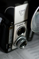
The image you see here is of an twin lens Argus 40. Use the link to learn more about the camera, it's history and see images of a mint condition one (mine is beat up somethin' terrible) and images made by this great little camera. I thought this would be appropriate subject matter since it's one of the precursors to the SLR. The image was shot "wide open." The exposure is 1/320s @ f2.2 . The lens is a 50mm (Standard) which can actually go as wide as F1.4 but I wanted to make sure I got the entire brand name in focus. My light source was a compact florescent bulb about 5 inches to the right of the subject and a folded piece of white paper for a fill card on the left. The newspaper is shown below the Argus 40; it just felt right to show two antiquated but completely functioning objects together.
Can you see the isolation that shallow DOF brings? Nothing is in sharp focus outside the words Argus 40, and even there sharpness begins to fall off at the 40 ever so slightly. The newspaper is illegible (which wouldn't be the case if I was shooting at an equivalent exposure like 1/2 sec. @ F 16. At a smaller aperture DOF increases forwards and backwards from the point in which the camera is focused. Depending on your intent, DOF is one of the most important tools in photography. It helps to create a point of interest, is key as a design element, and since it is tied directly to the basic operation of all cameras, crucial for the photographer to know how to use properly. The simple act of knowing what F-stops produce greater and less DOF will revolutionize any beginning photographer. You should be the one deciding your camera's exposure, not the camera. So many of the evolutions in photography (internal metering, auto focus, zoom lenses) are wonderful tools for the skilled user, but they have become handy-caps for the novice. Photography is a science AND art. You cannot do one properly if you neglect the other in this medium.
Okay, enough ranting... anyone want to know how to about how to mimic the blue hue in the above image? I use Adobe Lightroom 2.0 to edit my images. As a wedding and portrait photographer I deal in volume and Lightroom has been a saving grace. This year alone I have processed over 64,000 images in record time thanks to this well designed software.
Here is the original image. After importing it into Lightroom I adjusted the settings under the develop tab to these amounts:
Color Temperature: 2100 Kelvin
Tint or Hue: +18 (towards the magenta end of the spectrum)
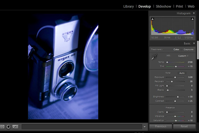
That's all it takes to fake the look to a tungsten balanced film shot in daylight. You see, the color of light is based on it's Kelvin temperature. Daylight is about 5500K and with the advent of color film came the need for multiple types of film to match the variety of light sources besides the sun. These include your regular 60 watt tungsten indoor lights, your florescent tubes and everything in between. I'm sure it didn't take long after these films hit the shelves that someone shot them outside and found a profound color shift. It's a fun trick and nice throw back to another era of photographic evolution.
If you plan to do the same thing in Adobe Photoshop here's what you need to do:

1. Create a Hue/Saturation layer
2. Use the drop down menu and select Cyanotype (yet another by gone style of yester-year)
3. Increase the saturation to the desired level. I chose 47.
Nostalgia and software aside, photography in all in the application. Tomorrow blog will focus on anther rudimentary element of photography; composition. Until then, please browse the portfolios at Irene Jones Photography Online for examples of how I've used depth of field in my wedding and portrait work.
Since the advent of the view screen, many point and shoot cameras (thanks to the habits of their consumers) have dropped the viewfinder all together. Even the Nikon D-300 I shoot with has the option of using Live View and skipping the viewfinder all together. This is just one example of how photography continues to adapt to the needs of the user. The SLR (single lens reflex) came from a similar revision that allowed the photographer to see exactly (or at least a more accurate view) of what would be captured on the film plain. Today film has given way to digital sensors and a whole host of people owning digital SLR's. Sadly though, many have fallen prey to the fallacy that by owning a camera with more megapixels, you will instantly take better photos.
As with all technology, operator error is the main reason for poor results. So for all of you that have said to me "I really like photography, I wish I knew more about it." Here you go. Free, uncensored advice from a pro on how to subtly improve the images you create. So let's start right now with something simple.
Depth of Field
Since Wikipedia already exists, you'll need to use the link above for a scientific perspective and exact definition of Depth of Field (DOF). Let's talk about the application of this technique. (And some other more advanced stuff just for fun).

Can you see the isolation that shallow DOF brings? Nothing is in sharp focus outside the words Argus 40, and even there sharpness begins to fall off at the 40 ever so slightly. The newspaper is illegible (which wouldn't be the case if I was shooting at an equivalent exposure like 1/2 sec. @ F 16. At a smaller aperture DOF increases forwards and backwards from the point in which the camera is focused. Depending on your intent, DOF is one of the most important tools in photography. It helps to create a point of interest, is key as a design element, and since it is tied directly to the basic operation of all cameras, crucial for the photographer to know how to use properly. The simple act of knowing what F-stops produce greater and less DOF will revolutionize any beginning photographer. You should be the one deciding your camera's exposure, not the camera. So many of the evolutions in photography (internal metering, auto focus, zoom lenses) are wonderful tools for the skilled user, but they have become handy-caps for the novice. Photography is a science AND art. You cannot do one properly if you neglect the other in this medium.


Okay, enough ranting... anyone want to know how to about how to mimic the blue hue in the above image? I use Adobe Lightroom 2.0 to edit my images. As a wedding and portrait photographer I deal in volume and Lightroom has been a saving grace. This year alone I have processed over 64,000 images in record time thanks to this well designed software.
Here is the original image. After importing it into Lightroom I adjusted the settings under the develop tab to these amounts:
Color Temperature: 2100 Kelvin
Tint or Hue: +18 (towards the magenta end of the spectrum)

That's all it takes to fake the look to a tungsten balanced film shot in daylight. You see, the color of light is based on it's Kelvin temperature. Daylight is about 5500K and with the advent of color film came the need for multiple types of film to match the variety of light sources besides the sun. These include your regular 60 watt tungsten indoor lights, your florescent tubes and everything in between. I'm sure it didn't take long after these films hit the shelves that someone shot them outside and found a profound color shift. It's a fun trick and nice throw back to another era of photographic evolution.
If you plan to do the same thing in Adobe Photoshop here's what you need to do:

1. Create a Hue/Saturation layer
2. Use the drop down menu and select Cyanotype (yet another by gone style of yester-year)
3. Increase the saturation to the desired level. I chose 47.
Nostalgia and software aside, photography in all in the application. Tomorrow blog will focus on anther rudimentary element of photography; composition. Until then, please browse the portfolios at Irene Jones Photography Online for examples of how I've used depth of field in my wedding and portrait work.
Subscribe to:
Posts (Atom)