Wednesday, April 14, 2010
Perfecting the Classic Pinup
 When I first opened my studio Terice quickly grabbed some good friends, a bunch of vintage clothing, and promptly began photographing 40's style pinups. Her shots are closer to glamor shots then boudoir pinups (which I'm grateful for- not interested in seeing women objectified). I must say that her first solo attempt in the studio turned out some nice images. She used hard spectral lighting sources which matches the lighting style of the era and her posing and composition has a modern sensibility without detracting from the intent. She showed me the photos, I showed her how to avoid some of the pitfalls next time (mainly how to light the while background evenly) and we both moved on. Time passed and I totally forgot about the session until this morning when I started digging through my archives from last year looking for a photo to use on this blog. Here's what I found.
It's pretty cute, but this blog is about showing how to make something better, so I decided to give the image a tune up.
To get from the unedited version to the classic look of my edit is just a few simple steps.
- Use the Liquefy filter to create an unrealistic figure. Pinups were not originally photographs. They were drawings for one reason; normal women don't look like Pinups! These days every photo is doctored. No joke. Everyone wants to look better then they really do and the good people at Adobe have made that possible. If you've never used this tool before it's simple. Use the bloat tool to increase bust size and the forward warp tool to slim and reshape curves. (I just vomited in my mouth a little while thinking about the unattainable standards women are held to.)

- Then I cleaned up the background with the dodge tool. The image is high key so to ensure that I didn't dodge out her skin and hat I used the magic lasso set to 15 tolerance. This preserved the areas I wanted to keep while allowing me to dodge out sections quickly.
- Once the background was a clean white I dodged out the shadow to make it softer. One thing was still off, she needed to look freakishly tall and leggy. So I used the marquee to select her legs and then used free transform to stretch them out.

- The final step was adjusting the color. Using levels to brighten her face while masking out her legs gives her a more consistent lighting pattern. I wanted a saturated, warm skin tone, as if the image had been shot with Tungsten lights on a daylight balance. I also wanted to add a little bit of that "old drawing" feel. So it was natural to apply one of photoshop's standard filters "water paper" on a duplicate layer. Fiber length was set to 1, brightness 60, and contrast 80. Once the filter applied, I set to the mode to soft light at 78%.

Tuesday, April 6, 2010
Come for the Coffee, Stay for the Overcast Skies
Seattle is my home, always will be (if I can help it). I love it here. Coffee shops out number natives two to one. Everyone dresses like they are ready to go hiking at all times. And it rains, more then I care to admit. Yes, when you live in a place where everyone is suffering from seasonal depression, your false god of choice is the sun.
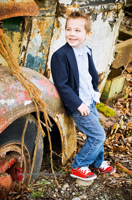
To this point, today I photographed my son Tyler minutes before the rain began to fall. In any other place common wisdom would suggest that today wasn't the right day to trespass into a secluded car graveyard with preschooler and camera in hand. (Some of you are thinking- it's NEVER a good idea to trespass. You are correct; but I lean towards getting the shot and then asking forgiveness later.) The reason I was so willing to risk rain and hillbilly gun fire was the light. Perfect, seductive, overcast light.
The combination of high clouds bloated with moisture and the noon day sun makes a celestial soft box that will softy kiss the cheek of any subject and provide delicious saturated colors. Minimal work, I just have to be there. Joe McNally's blog (which I highly recommend) spoke of this back in Feb. As a photographer we wait on the light, we are subject to it's every whim, and love every moment.
Tyler on the other hand was not so enthusiastic. The clouds and approaching storm meant cool temperatures and wind that he said "hurts my eyes." I bribed him heavily and he smiled about three times.
The real magic of this photo I think is the shoes. The red pop is really nice and the color on the car is classic. I did however enhance it slightly. This is an easy trick though. Create a layer in photoshop and set it to color mode with about 20-30% opacity. Then chose a deep rich color and paint on your layer. The color will be applied to the image. I made several different color layers with different tonalities and opacities to achive the desired look. The rope was also traffic cone orange in the original image. I toned it down by adding a slight green on one of my color layers. Finally I increased the saturation and contrast slightly, watching carefully to avoid loosing information in the highlights and done! The 24x36 gallery wrap print is already set to be ordered and placed above my fireplace (with the images of his sister and brother of course) in just a few weeks.
Subscribe to:
Posts (Atom)