Saturday, December 12, 2009
Studio Lighting Basics: Part 2 Using a fill light.
 If you did your homework yesterday and studied the vocabulary words I gave you, then you are ready to talk about using fill. There are a lot of different methods for adding fill light. The easiest is using a fill card or reflector. I have white foam core (the kind used for mounting prints) in a couple of sizes that I use for fill cards. I also have a collapsible 4-in-1 reflector that I take everywhere. The reflector is far more portable then the foam core but both are often needed when trying to use one light head to create two sources of light.
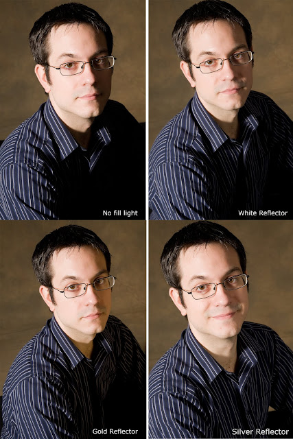
 Our first picture (top left) is with a single light head placed at 45 degrees from the subject (my husband) and me on camera left. You can see how the contrast between the highlights and shadows is pretty dramatic and a good portion of the face is quite dark. On the second image I added a white fill card. Notice how the shadow side is now about a half stop lighter? The lighting ratio has gone from 4:1 to 3:1. Most traditional portraits are either a 2:1 ratio since it allows for some shadow but there is still detail. (See earlier posts for more info on this subject.) The fill card is positioned at 90 degrees from Caleb. Next the white fill card is replaced by a silver reflector. The quality of light on the shadow side has changed. The silver reflector is brighter then the white fill card. Now we're up to a 2:1 ratio. Finally I flipped the reflector over to the gold side. The intensity of the light is about the same as the silver side, but the color shift is the most obvious change.
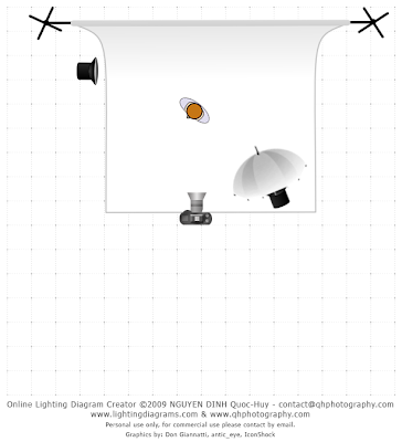
 Keep in mind a reflector does just that, it only can bounce light already available in a new direction. If you want a greater intensity or light from an angle not directly proportional to your main light you'll need to use flash as your fill. On the next image (right) you can see the fill light on camera left bringing up the shadow side of his face to be as bright as the main light, maybe even a little brighter. Because the fill is positioned slightly behind the subject instead of next to him like a reflector might be, a small sliver of shadow is created along his temple and cheek bone. This kind of lighting style really adds three dimensionality to the image. The key light is diffused where the fill is not, and because of the angle, the fill light has become very textural.
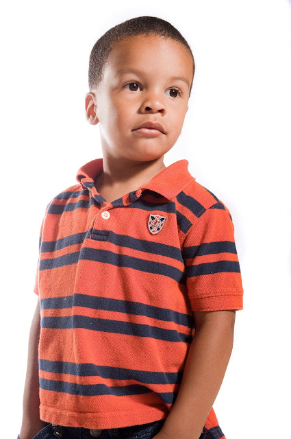
 Can you guess how old this kid is? Would you believe me if I said 3? It's true, the posing and lighting make him look older then his age and I did this intentionally. I had plenty of photos of him being goofy like all little boys are, what I wanted next was something that spoke to a different emotion. Unlike shooting on location where you have a sense of place to help tell a story, in the studio you have only the light and your subject. Light is your only tool to create a fresh perspective. That challenge alone is what keeps my job new and interesting.
 Before anyone asks, about how I got the white background to be clean and even I'll admit that I did something I don't normally do, I used the fill light as both a background and fill light simultaneously. Most of the time I use a light for the background separately since I want to be able to control each layer of the scene, but I was able to get away with this for a few simple reasons.
 The background I used was only 5' wide and my subject is standing pretty close to it. Normally I try to put distance between the subject and the background so no shadows fall on the vertical plain, but I didn't need to worry about this because the fill light was positioned in such a way that it's light illuminated both the side of the subject and the background. The fill light was powered to full and with it's close proximity to the background it was far more intense then the main light which was only at half power. This is what caused the background to loose all detail since the camera's exposure was set to match the main light's setting. (1/320 @ F6.3 with ISO 200) In simpler terms, I over exposed the background.
Next up we will talk more in detail about shooting on a white background and the traditional three light setup that has defined studio portraiture.
Subscribe to:
Post Comments (Atom)
Nice and simple setup for the kid, and the result is great as well.
ReplyDelete@ Stafan
ReplyDeleteThank you! Simple is often the best solution! That way you can concentrate on getting the most out of the client.