Monday, November 16, 2009
Photographing Infants: Why Black and White is Back
 Today I want to get a little more technical and talk about color vs. black and white. For my generation black and white is very popular. We ( the 20 and 30 somethings out there) associate it with editorial or candid photography and consider it timeless. My parents age group (baby boomers) often find black and white boring. The main difference stems from the fact that color photography did not become widely used until the late 1950's and into the '60's. Color films ( such as Kodak's Kodachrome) had been available to the public since 1935 but was considerably more expensive and difficult to process compared to black and white. As color movies became more popular in theaters and color televisions became fixtures in homes across America, consumers turned from "traditional" black and white films to the vibrant colors of slide film. With this transition a new form of torture was invented; the slide show. Countless girlfriends and neighbors have been bored to tears during one of these events. 2009 was the year in which Kodachrome was retired by Kodak marking the end of an era. No worries though, thanks to social networking and the advent of digital photography badly exposed or blurry/unrecognizable images are everywhere and multiplying at an exponential rate. Now would probably be a good place to mention my Facebook page! Please become a fan. You can also follow me on Twitter.
Shameless self promoting aside, let's see some photos shall we? In case you haven't already guessed. These are my baby's feet. This image above was shot at 1/60 @F2.8 with my 50mm lens.
For comparison sake, the same image is shown in color on the right. Notice the difference in contrast between the black and white version and the color version. Personally I like my color images with less contrast and I avoid over saturation since I also want my colors to look natural.
Black and white is a different story though, additional contrast is necessary to help separate the shades of gray from one another. It also changes the mood of an image. The black and white version emphasizes texture. By removing the distraction of color the viewer looks only at the light and shadows. This most basic photographic style hits directly to the heart of what photography is all about: the interplay of light and dark. This is also why it lends itself so nicely to infant portraits. Infant portraits most frequently seek to minimize the amount of information in an image and instead focus your attention on the tiny features of newborns.
Since most of us aren't shooting black and white film let's talk about how to make the best possible black and white image from a digital file. Photoshop provides several ways to convert an image to black and white, a few of which I'll show you here. Lightroom also does a very nice job with black and white. Let's start with Photoshop. The most basic ways to change a color image to black and white in Photoshop is either the Desaturate or convert to Grayscale Here are the results.
The Desaturate option converts colors exactly as they are where the grayscale tries to estimate what they should be. Both are good efforts but not exactly right. With either method, all of the colors are converted to a shade of gray. Reds and greens often become the same when converting between color and black and white. The image then looses contrast and lacks a diversity in the tonal range. Or as my college professors used to say it looks "flat" or "muddy". I always wanted to ask if those were technical terms... When the tonal range has been dramatically reduced like this doesn't the image seem less interesting since the details are not as clearly visible? To fix this the next step needs to be introducing more contrast to increase the tonal range. This can also be done a number of varying ways. Adjusting the Brightness/contrast is the most basic but it gives you the least amount of control.
Select Image>Adjustment>Brightness/Contrast to get the menu shown above. I increased the contrast 100 percent (I would have done more if possible) and decreased the brightness slightly (shown as a negative number). Here is the resulting image.
When using the levels adjustments (Image>Adjustment>Levels) you have three sliders, black on the left, midtones in the middle (obviously) and white on the right. By adjusting these sliders (your midpoint moves whenever you adjust either the black or white) together or separately you can increase contrast. Since the levels adjustment is based on the histogram of the image you can see visibly where the tones lie and change the image accordingly. One step better then using the levels is the Curves adjustments. Like the levels adjustments, curves are based upon the histogram. The main difference is when editing with the curves is control. You can also plot points along the histogram where you would like to retain specific values and expand or decrease the amount of highlights and shadows individually.. In the next screen shot you'll notice three lines in the curves window that overlap the histogram. The blue line is the suggested balance, the gray is the original tonal range and the black in my adjustments.
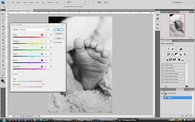
Better then converting to grayscale or desaturating, Black and White adjustment combines the steps we've been talking about while providing the most versatility. Select Image>Adjustment>Black and White.

The adjusted values are:
reds: 10%
Yellows: 49%
Greens: 31%
Cyans: 79%
Blues: 73%
Magentas: 45%
Notice how the version of our feet photo in the screen shot looks rich and interesting. The details are more pronounced and all of the shades of gray separate creating a more visually dynamic image.
For Lightroom the process is similar to the black and white adjustment in Photoshop, the terminology is the only difference. Select your image in the develop module and then use the grayscale button to convert into grayscale. You can then adjust your highlights with the recovery slider and the shadows with the fill light and/or blacks sliders. Contrast is pretty self explanatory. By adjusting each of these separately you can gain the most control over the tonal range of the image. Best part is that with Lightroom you can make these adjustments on multiple images.
The first black and white version of this image was edited with Lightroom. Just for fun, here's a few more photos of Alex also edited in Lightroom by applying the same settings as the baby feet photo..
Though I have talked a great deal about the benefits of black and white over color I don't want to diminish color photography. As with all styles, each has a place and purpose. When it comes to infant photography I personally prefer the black and white because of it's simplicity. Details, texture, and light are emphasized. Room is provided for story telling. It only seems appropriate that the simplest members of the human family are documented in a simplified format. Let me know what you think. I'd love to read your comments!
Next up tips for making an infant portrait shoot more successful.
Subscribe to:
Post Comments (Atom)


No comments:
Post a Comment